


This post will show you how to create a reusable component for PowerApps, which you can then place on multiple screens in the same app, or export and use on multiple apps.
Overview
In this post, I’ll show you how to create reusable canvas components for your PowerApps. If you haven’t seen the announcement and intro videos for this feature, I suggest you check those out here first:
https://powerapps.microsoft.com/en-us/blog/components-available-in-preview/
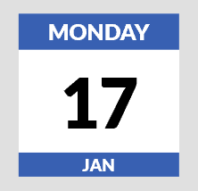
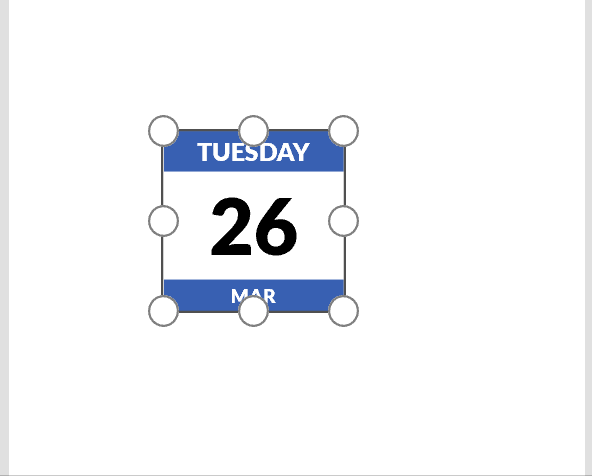
For this example, I’m going to create a control to display today’s date, visualized as one of those daily tear-off calendars you might have seen at some point on someone’s desk.
Since the component will be reusable on multiple screens, I’ll add properties to the control to set the data and visual configurations. I’ll also show how to use relative sizing to scale the controls when the component is resized, and how to scale font sizes as well.
Creating the App
For this post, I’ll create a new blank Canvas app, using the Phone layout. I’ll name the app CalendarComponent (from File > App Settings), and then Save it (always name and Save your app right away to avoid losing work if your browser closes).
Enabling Components
Components are an experimental/preview feature right now (March 2019), and in order to work with them, you first have to enable that feature. You can do this by going into your app, and navigating to File > App Settings > Advanced Settings. At the bottom of this screen, you’ll see the option to enable Components:
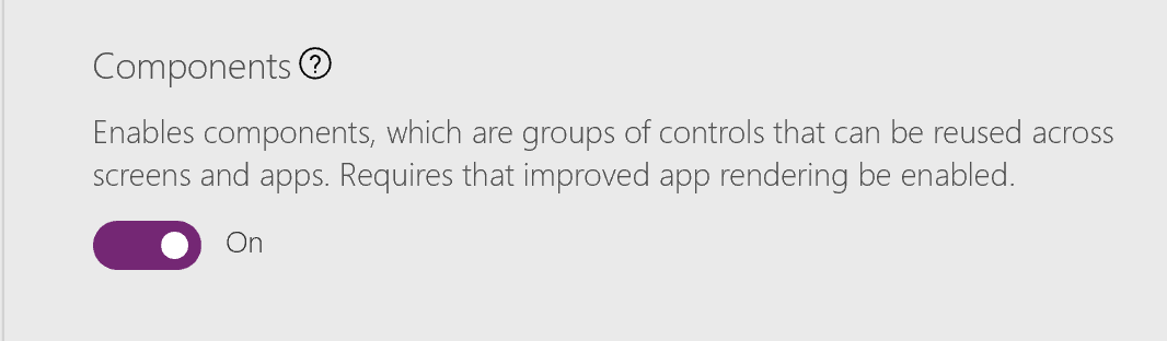
Once enabled, you should see a Components menu item on the Insert menu:
Building the Component
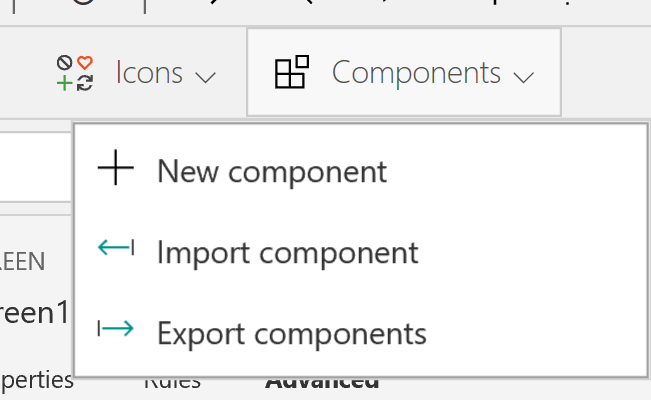
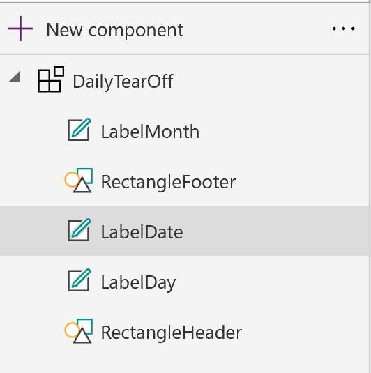
From the Components menu, I’ll select New Component. I will rename it to DailyTearOff.
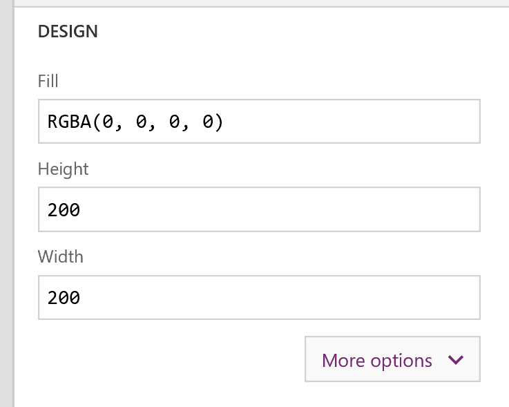
The first thing I will do is set the component width and height. Your component can be resized once it’s placed on a screen, but this size will be its initial default size. I’ll make this 200×200 pixels:
Next, I’ll add some controls to the canvas.
- A rectangle, 200×45, placed at the top. A label on top of this also 200×45, with font size 21 and Align.Center, Color.White, and Font of Lato Black.
- A label for the date number, 200×120, font size 64, Align.Center, and font of Lato Black. Place this directly underneath the previous two controls.
- Finally another label and rectangle at the bottom, similar to the top, 200×35, font size 16, Align.Center, Color.White, and Font Lato Black.
It should look like this so far (the text in the labels is just static text I typed):
Here is what the initial control tree looks like (I’ve renamed the controls to work with them more easily later):
Adding Properties
A component can have properties, just like other out-of-box PowerApps controls. I’ll add some properties to control the data and display of the component. The first property I’ll add is a Date property. I’ll name it Date, and set the data type to Date and Time, and click Create:
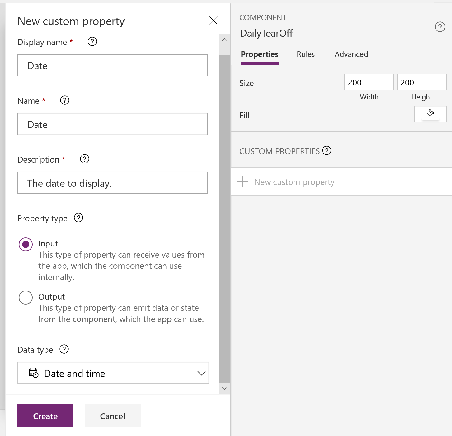
If I click the component in the tree view, and look at it’s properties, I will now see Date. Also notice that it is set to a default value of Now(). I could change that default if I want, and it will also get overridden with whatever the user of the component sets as the value.
Next, I’ll add some properties to control the display of the date info. For example, Month display could use long month, or short month format. Same with the weekday. I could also control casing of the month and day values if I wanted to with additional properties (I’ll leave those as another exercise for the reader).
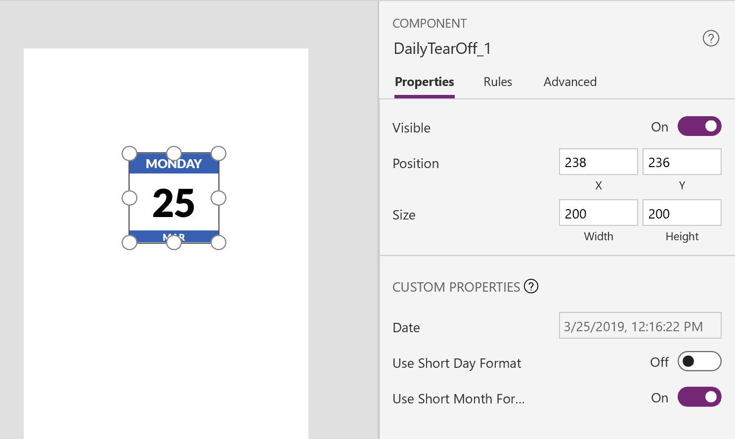
I’ll add the following additional properties:
- UseShortDayFormat – Boolean, Input
- UseShortMonthFormat – Boolean, Input
Wire the Component to the Properties
Now that the properties are defined, I’ll wire up the component to the values. First, I’ll wire up the Date property so it controls the label values. I’ll start with the day number label. In the Text formula, I’ll put the following:
|
1 |
Day(Parent.Date) |
In this case, Parent is the Component itself, so we can reference it that way.
Next I’ll adjust the month and day of week label displays. To get the names of the weekday and month, I’ll use the Text function, with a custom date format string. I’ll also use the boolean properties to control short/long display, and then force upper case. In the day of week label, I’ll put the following:
|
1 |
Upper(If(Parent.UseShortDayFormat, Text(Parent.Date,"ddd"), Text(Parent.Date, "dddd"))) |
In the month label, I’ll use the following:
|
1 |
Upper(If(Parent.UseShortMonthFormat, Text(Parent.Date,"mmm"), Text(Parent.Date, "mmmm"))) |
Testing it Out
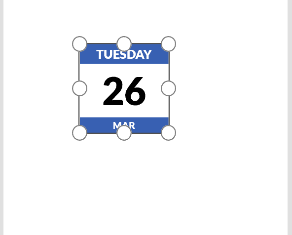
Now that I’ve got it wired up, I’ll test it out. I’ll switch to one of my screens, and place the component on the screen. It looks nice!
However if I resize the component, not so much:
Relative Positioning
In order to get this to resize well, I’ll have to use relative positioning, adjusting the width/height as well as X/Y positions of the elements, relative to the parent component size. There are lots of ways to do this depending on your requirements, and how I approach this below is just one way of doing this.
For my approach, I’m not going to be concerned about growth in Width so much, but rather when the height changes, I want to adjust the elements inside and scale them. So for all of the controls inside, I’ll change all their Widths to match the component’s, using Parent.Width. To speed this up, I’ll use Ctrl + A to select all the controls on the component canvas, pull down the Width property from the formula bar, and put in Parent.Width.
For the height, I’ll need to know the ratio of the items in their original default sizes (200×45, 200×120, 200×35). Then I’ll adjust the height of each control to be the height of the parent multiplied by this original ratio (CurrentParentHeight * OriginalControlHeight/OriginalControlWidth).
For example, for the top rectangle, I’ll set its height to the following:
|
1 |
Parent.Height*45/200 |
I’ll go through and do this same thing for each of the controls on the screen.
Finally, I will need to adjust the Y position of each control, so that each control is positioned correctly during resizing. The top label and rectangle will always be at the top, so they will be fixed at Y=0. For the ones underneath, I’ll use relative Y positioning. For the main day number label, I’ll set the Y value to this formula:
|
1 |
RectangleHeader.Height |
For the bottom ones, I’ll set it to the following:
|
1 |
LabelDate.Y + LabelDate.Height |
At this point, it works much better, with the exception of font-scaling.
At large/wide or small/skinny sizes, it would be nice if the font also scaled as well. Let’s see how we can accomplish that. Fonts are specified in points in PowerApps, and we can convert to pixels with this formula: 1pt = 1.3333333 pixels
If we know the ratio of pixel size to the overall height of each label control, we can adjust the font accordingly. The formula I’ll use is the following:
|
1 |
OriginalFontSize * (CurrentLabelHeight/OriginalFontSize*1.33) * (OriginalFontSize*1.33/OriginalLabelHeight) |
If I place this in the Size property of the label for the Date number, I’ll end up with a formula like this:
|
1 |
(64*LabelDate.Height/(64*1.33)*(64*1.33/120)) |
EDIT 3/28/19: As my backpacking middle-school math-wiz son points out, above can be simplified to:
|
1 |
OriginalFontSize * (CurrentLabelHeight/OriginalLabelHeight) |
In the case of the Date label:
|
1 |
64*LabelDate.Height/120 |
Now it sizes much more nicely!:
Summary
Hopefully I’ve showed you in this post how to create a component, along with some approaches for resizing the controls inside.